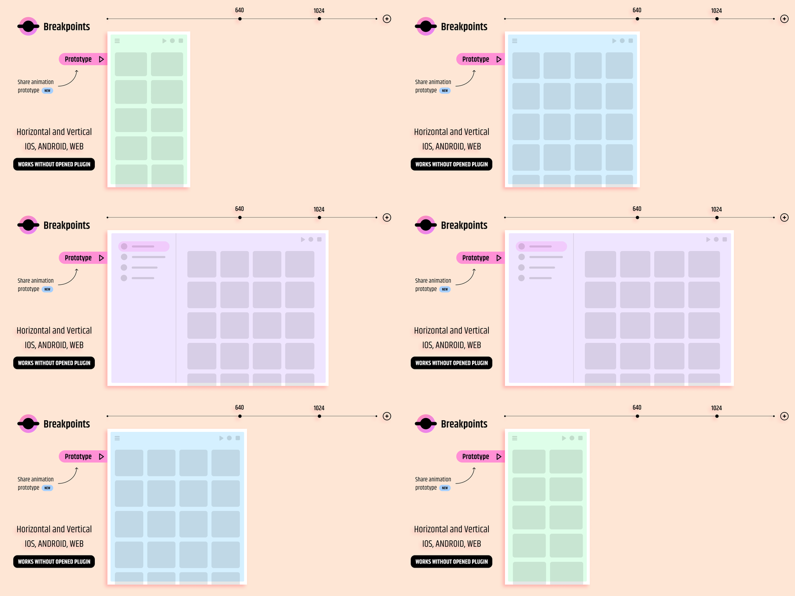
Breakpoints: Simplify Responsive Design in Figma for Seamless Development 🖥️📱
As a designer, ensuring your designs adapt seamlessly across different devices is key. The Breakpoints Figma Plugin is the perfect tool to streamline this process, helping you create responsive and adaptive layouts effortlessly. Whether you’re designing for desktop, tablet, or mobile, Breakpoints allows you to define how your design elements shift and scale based on the screen size. This is especially beneficial for UI/UX designers and developers working on responsive websites or applications.
Use Case: Breakpoints is essential for designers who need their Figma designs to respond dynamically to different screen sizes. It’s perfect for anyone developing complex user interfaces that need to function on multiple devices, such as web developers, product designers, or teams working on cross-platform apps. The plugin eliminates the need for tedious, manual adjustments and ensures that your designs remain consistent across various screen sizes.
How to Use Breakpoints in Figma 🚀
- Install the Plugin: Head to the Figma plugin library, search for “Breakpoints,” and install it with one click.
- Set Breakpoints: Choose the frame you want to work on. Open the Breakpoints plugin, and set the desired screen size breakpoints (e.g., mobile, tablet, desktop).
- Define Layout Adjustments: Adjust how the elements should behave when the screen size changes. For example, you can specify how columns shrink or expand, how images resize, and how text wraps.
- Preview Responsiveness: Test how your design responds to different screen sizes by toggling between breakpoints.
- Export and Use: Once you’re satisfied, export your design with the responsive properties in place and share it with your developers.
Key Takeaways 🔑
- Save Time: No need for multiple artboards – set breakpoints in one frame.
- Consistent UI: Ensure consistency across devices by defining responsive behaviors upfront.
- Developer Friendly: Smooth transition from design to development with clear breakpoints.
- Optimized Layouts: Achieve pixel-perfect, adaptable designs.
- Streamline Design Process: Focus on creativity while the plugin handles responsiveness.
Why Breakpoints is a Game-Changer for Figma Designers 🎨
Breakpoints addresses the common pain point of responsive design by allowing designers to define adaptable layouts within Figma. Without this plugin, designers often have to create multiple artboards for each device size or rely on developers to interpret how a design should adapt. Breakpoints removes this barrier, ensuring the final product aligns perfectly with the original design intent, no matter the screen size.
Key Features:
- Custom Breakpoints: Set unique breakpoints for any screen size, from mobile to desktop.
- Adaptive Layouts: Define how elements should adapt when screen dimensions change.
- Real-time Preview: Instantly see how your design responds to various device widths.
- Developer Collaboration: Streamline communication between designers and developers by defining clear layout behaviors.
- Single Artboard Solution: Work in a single frame rather than managing multiple artboards for each device.
Conclusion: Simplify Your Responsive Design Process Today 💡
In today’s digital world, creating responsive and adaptable designs is non-negotiable. The Breakpoints Figma Plugin makes this process significantly easier by giving you the power to define how your layouts should behave across different screen sizes, all within a single frame. Not only does this save you time, but it also ensures that your designs remain consistent and functional, no matter the device. Whether you’re a seasoned designer or just starting, Breakpoints is an invaluable tool to have in your Figma toolkit.
Discover more from AI Founder Kit
Subscribe to get the latest posts sent to your email.